


MexArt
Logo, identity and website
Mexart is a retailer based in the UK that brings the best and most original arts and crafts from Mexico. The brand is fun and colorful in a contemporary and elegant way in order to convey the high quality of the products that have been carefully selected. The shop is planning to bring not only wood carvings but also different art techniques, therefore the branding had to work with different products.
The logo is an abstraction of a religious symbol called “Ojo de Dios” (God’s Eye), an artefact created by the mexican huichol population, which symbolises seeing and understanding that which is unknown and unknowable.


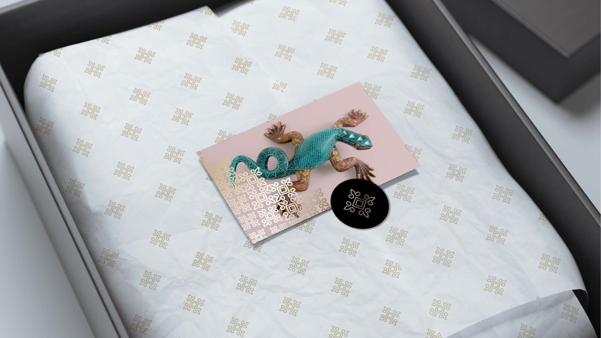
A neutral colour palette was chosen in order to let the intense colours of the products stand out, hence a primary colour palette of black, white and gold was used. For the secondary palette a pastel range was chosen. These colours are exclusively used for the product photography backgrounds.

